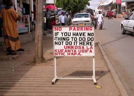
Some of you might already know this picture Christoph Grandt has published on his picturesque website some time ago.
I’d printed it out the other day and stuck it on the door.
Why? Three reasons:
1. The banana peel next to the signboard. A lovely detail.
2. The message is direct – if you have no-thing to do, do not do it here. (UKIKOSA ????)
3. This is Kenya. I have no additional information on this picture and in fact, I forgot to ask Bw Grandt about details on where exactly he took this pic (maybe in Kitui, as the other pics are from that area). If you look at this signboard, one instantly seems to think that the layout of the letters could have been better ~ is just horrible. Yaaani, I think that some Muhindi businessman draw this "arrangement" with his BIC® on a piece of KARATASI® paper and gave it to a "signboard artist". Now, Kenya being Kenya, the artist might have thought that it would be better to just do the job the way he’s used to. Of course he could have come up with his own idea of how to arrange the whole design/layout, but instead, he apparently just tried to make those letters fit onto the signboard.
And that exactly is the difference between Germany and Kenya, for instance. If you happen to find such an "artist" over here, he would most definitely tell you that it is not possible this way. Instead, he would tell you that he needs a bigger signboard or need to change something about it. And I remain with the question: what’s better?


 "
"