the FF3 map

There are those maps out there which are based on statistical data – assumed, accumulated and unproven figures that may indicate a certain trend and/or just show what the situation has been when the data was collected.

When we look at today’s map of Firefox 3 downloads worldwide in just 24 hours (for a world record):

firefox

…I really wonder what ppl will say about this in future, and also how many organizations will take THIS as a basis for their future planing on the availability of internet access, the spread of alternative internet browsers (such as the Firefox 3 suite) and what kind of internet-saturation (?) it takes to actively participate in such a call for a world record (read: the request to download FF3 on this particular day was imho promoted through the blogosphere? If so, it could be a nice indicator for the blogosphere).

However – 8,9 million downloads in just one day are just impressive!

1,51 kilometres

embugoogle

1,5km is what I walked to the office every morning while in Embu. About 1,5 km from my room in downtown Embu to the WRMA office behind the law courts.

I just measured that via Google Earth. Eh! :-)

Ok, sijui if they have already been around for some time, but I’ve just started Google Earth again and discovered some new, HighRes maps from 2007 on various locations in Kenya. Now….this is just cool. Really.

(Yeah, we’ve been using GE to spot swimming pools in the past but mind you: blue spots on the map aren’t pools but corrugated sheets as used in rural areas.)

“wapi?” (part 8)

karuracid

Kenya Tourists (KTs) will clearly identify this screenshot from GoogleEarth as Karura Forrest & CID HQ (blue roofs) next to Kiambu Road.
Kenya Residents (KRs, or Kenyan Roots as M puts it) will use this to remember what Karura Forrest looked like before it was castrated / sacrified for technological progress aka urbanization.

(technorati-should-be-keywords: how to we explain this to our children)

GIS in/for Kenya

I read this story on GIS services to be installed at the Police in Kenya (for crime tracking) and a conference/workshop that had been in held in Nairobi on this matter, organized by ESRI (GIS software company).

Someone was quoted as having said that all GIS services // data should be organized in a central database and made available to anyone who needs to work with it (free & against charges).

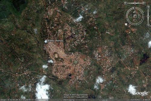
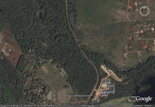
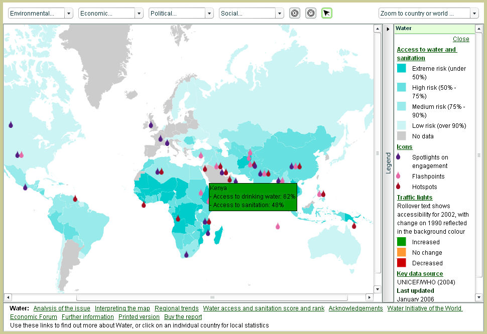
Earlier this week I started working on some GIS maps for Kenya and combining a pysical map of a water catchment area with local attributes (poverty figures, etc.). I do agree that such maps should be stored in a single database so that all organisations and instutions in Kenya are using the same maps and shouldn’t start coming up with their own homebrewn versions. There’s no need for double work.

Ppl in Kenya know this and I am not the first person who had this idea. Yani, between having the idea and actually maintaining such a database is a huge gap. Does anyone know where to obtain maps & figures for Kenya?

So far I have collected data from these online resources:

Depha.org – Data Exchange Platform For The Horn Of Africa (good!!)

GeoCommunnity (Kenya national data )

ILRI Kenya – International Livestock Research Institute (awesome collection)

…and another resource I just can’t remember right now…

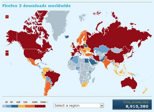
While googling for free gis data, I came across a workshop that had been held recently in Nbo and which showed that the top officials of the Ministry/Authority I am currently working for had been officially informed on the proper use of GIS systems. So….these folks know about the advantages and received proper training I wish I could have enjoyed as well. It seems that GISystems have been introduced many times in Kenya and still there is no central database for such data. Or is there?

Which brings me to another thing I wanted to mention: Like in any other country, there are the ordinary wanainchi on the streets and some very smart and intellectual people that always impress me with their exact analysis and understanding of certain situations. Social, political, environmental – you name it, they can explain it – and even under a historical context. Koigi isn’t the only frustrated intellectual out there, there are many others who qualify to substitute even those typical 1970s university dons (with their hatred and aggregated mzungu aggressions) and help build this country.

Well, you see, the reason I mention this normality which otherwise would imply some sort of contemptuousness for the rest of the nation is that our former landlord G.Kirima – to name at least someone – used to be Deputy Major of Nairobi in 1974 ALTHOUGH he doesn’t even know how to write his name. Now that’s 32 years ago. And Kenya has changed kabisa. The nation of drunkards, as some like to call it, also knows that a beer never goes without a story. The intellectual wit, this desire to get an understanding for the overall context and mix everything to a big picture while at the same time keeping this timeline and analysing political circumstances with social developments – I think that’s one of Kenya’s biggest potentials.

Happy 144mio Kshs. Heroes Day!

map-o-rama

maplecroftsmall.jpg
(click on image to enlarge)

"Maplecroft maps is a highly visual web-based resource which contains detailed country information for over 200 states and maps key social, economic, environmental and political issues and their significance to business and society.

The interactive map enables users to view an issue individually or in combination with other issues in order to illustrate the relationship between two or more associated topics.

This innovative tool is designed to raise awareness amongst corporations, government and non governmental organisations, academics and students of how an organisation’s operations interact with wider society, and how the risks and opportunities generated can be responsibly managed through stakeholder engagement and partnership.

For each specific issue, the map features:

    In-depth analysis – emphasising its impacts and significance to business and society in general, as well as providing a framework for action;

    Country shading – illustrating the pervasiveness and risk ranking of the issue being mapped;

    Traffic light system – applied to indicate whether the indicators relevant to the issue have increased, decreased or remained the same as in previous years;

    Hotspots – specific areas are identified that are currently severely affected by the issue;

    Case studies – positive and negative examples of how companies have managed the challenges that they have faced, in particular with respect to the interface between business and civil society.

The interactive map tool itself will be regularly updated with new features to make it easier and more enjoyable to use. New issues will be added to the tool at regular intervals, as well as enhancements and updates to existing issues, adding depth by incorporating new research, data, case studies and policy developments as they become available."
(source: http://maps.maplecroft.com/)

This is SUCH a great tool – in fact, I’ve been planing to do something like this (a web-based GIS overlay map) for the internet but these Maplecroft maps already contain all I ever needed. Great!!

[hat tip Black Looks!]