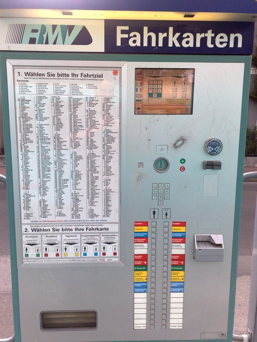
As much as I dislike rants on this blog, there’s nothing worse about local public transport in the Rhein-Main area (Frankfurt am Main et al) than this ticket machine in use at all metro stations:

Even though the menu is available in different languages, obtaining a valid ticket is really complicated for those who do not know how to operate it.
- for tickets within the City area of Frankfurt am Main, just press the “Einzelfahrt Frankfurt” button which is the 7th (red) button on the left column.
- for tickets to destinations outside of the City area, one has to choose it from the list on the left (note: not all are listed!), type in the corresponding 4-digit number and choose “Einzelfahrt” (first red button on the left column marked with an adult icon/pictogram).
As you can see from the picture, the machine also accepts banknotes, chip cards and certain mobiles. Pls also note the already mentioned coin-scratch-area to the right of the coin slot which – for some reasons – is ALWAYS on the same spot with all machines.
RMV apparently knows how bad their machines are – which is why they’ve published a detailed explanation online.
What I dislike about these machines:
Why make it complicated if it can be done way easier instead? Just put a coloured map of destinations on the left and assign 4-5 buttons on the column to the right that correspond to the coloured destinations.
Why do they offer the (rather primitive, no-touch-) screen in five different languages (German, English, French, Italian, Spanish and Turkish) if the rest of the machine is kept in German only?
If they’re already using pictograms for language symbols and age groups, why can’t they extend this to the overall interface?
Too many buttons are confusing! After all, you just want customers to obtain a valid ticket. 4-5 buttons are enough!
Do not offer too many steps during the ticket-selection-process. Instead, use something like this:
- Destination?: Where do you want to go? 1-5 price groups, not more!
- Discount?: Adult or child (~ discounted tariff for disabled, elderly, students, children, etc.)?
- Payment?: Insert money (bank notes, coins, chip cards, mobile RFID chips, etc.)
- Done!
Sometimes I just wish I was working in automation engineering (instead of in the field of ecological sanitation systems) and could approach the RMV with a simple upgrade proposal for a better user interface on their ticket vending machines. And this although I am not even an Apple user :-) and since there are others out there who are real professionals for keeping things really simple. Much like the upcoming elections in the US, anything is better and will be an improvement to the existing system. Right now the purchase of tickets through these machines is more complicated for most customers than programming your VCR.
Also, if I was into automation engineering and had to deliver a diploma thesis, I’d cover this subject.
p.s.: The red little sticker next to the mirrored image of yours truly & “Wählen Sie bitte Ihr Fahrziel” actually indicates when it was cleaned (!) for the last time.

I cannot agree more.
Great designs generally suck because of lousy user interfaces.
Google is categorical that every web designer should ensure that a web site makes it easier for a user to achieve their goals.
Go to the next site you can click on. Chances are you won’t visit 5 sites before you encounter one with a really lousy navigation or confusing and/or distracting graphics.
This is where Apple Inc. reigns supreme. Their amazing designs endear users to Apple products.
And this applies even to the GUI on most software products.
Every designer worth his/her salt needs to put the user first.