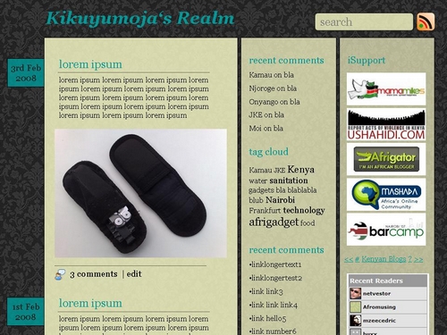
As mentioned earlier, I am currently searching for a new template for this blog. Don’t get me wrong – the current Sirius theme is great and offers lots of comfort and whitespace, but it’s from 2006 (dev unfortunately stopped since then which is such a pity!) and so I thought about going for a new one. Simple as that.
Most templates aren’t that 100% perfect though and/or still require lots of tweaking. So what IF i come up with my own layout? Instead of stealing something from here or there and mixing it all up, let me just do some try&error sketching and present it here as a raw draft:

Actually, I like this grey wallpaper, also have it on my desktop. Wallpapers are a bit too 1990s, but so what. Used to have no image on my desktop to save RAM + keep it fast & clean, but nowadays I just dont care. So, the basic idea was to create something around this wallpaper that doesnt look too ..ahh…strange ? :-)
Next task was to see which colour may fit. I need lots of whitespace due to my inability to include transparent backgrounds to the smaller banners. Whitespace looks nice. Lakini here, there’s no whitespace. Only transparent ebony(-white) supposed-to-be-slightly-rounded boxes that have a yellow-ish touch to it. White on ebony/yellow – does that work?
Then the font colours. I somehow like that green/turquoise. Sijui why. Maybe because of my Kikoi banner on the Sirius theme.
As for fonts: GEORGIA! Lovely font.
Icons by FamFam and 69mb (thx!).
1 content bar, 2 sidebars. 1st sidebar for blog related links (recent comments, links, meta, etc.), 2nd sidebar for external promotions / google adsense etc.
Thought about giving them some transparency – the most important one (= content bar) with the lowest transparency and so on (as pictured).
Overall width ~ 900 px, should display @ 1024×768. Oh, and content bar should be 505 – 530 px for all my 500px images + margins.
Everything else is work in progress. Before I continue, I would like to hear/read your HONEST opinion on this. Does this look OK or just horrible? Remember, I am the guy who does these things, so I may be a bit strange sometimes…
Any feedback is appreciated! :-)
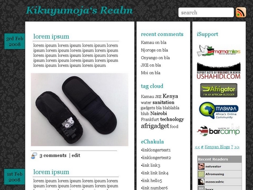
Oh, and with white layers:


… not too sure about that turquoise green/grey combo to be honest. It makes it look very dry and tame a bit like Leberwurst if you know what I mean … I like the date flag/tags on the left though. And what about the headline font?
I vote for the second shot. I prefer white a background.
the second one, though i am not sure about the grey wallpapery design on the background. :)cant it be replaced with something else? Lakini if you penda it, its cool.
I vote for the white layers too, that comes out pretty nicely with the turquoise headings. I find the wall paper ok but I’m also not too sure about the turquoise on grey.
PS: Glad to see you like the feed icon :)