I started using the free synchronisation services @ mobical.net and am pleasantly surprised at the ease with which I can now synchronize the address book on my mobile phone with an external website.
Mobical isn’t perfect, and I just use it to backup and edit my data more conveniently, but nevertheless it is a bit better than using MS Outlook (which, as an MS-Windows solution, isn’t free of charge) and best: it works. Hassle-free.
…which makes me WISH that my prefered webbased email provider should offer the possibility to actually synchronize a mobile phone’s telephone book as well as the SMS / MMS inbox, bookmarks, notes and, most importantly, the calendar with my email box. Just a neat all-in-one solution.
I wonder why in a world of wide networks and a huge repository of good, free and open software, some tasks like the exchange of data are still such an issue?! Just think of the various Character Separated Values, Comma Separated Values or Colon Separated Values (CSV) formats that exist as there’s no common standard on this. *sigh*
Which gets me to the next issue that has been bugging me for some time now: The Nokia N95 is a great telephone as it comes with lots of useful multimedia features which are still hard to find with other phones.
However, having switched from a Nokia 6230i that offered an ideal keypad to key in short messages and other text, i find the buttons on the N95 rather unuseful and also ugly. Especially the keypad just below the top screen is horrible. I wonder who passed this design from R&D to production?
Anyways, in short: i like the phone but think that it still comes in an ugly packaging. Especially the front cover could enjoy some redesign. This should actually be possible as it is only secured by four screws on the back.

the design issues i am having with the N95…
So what’s the task?
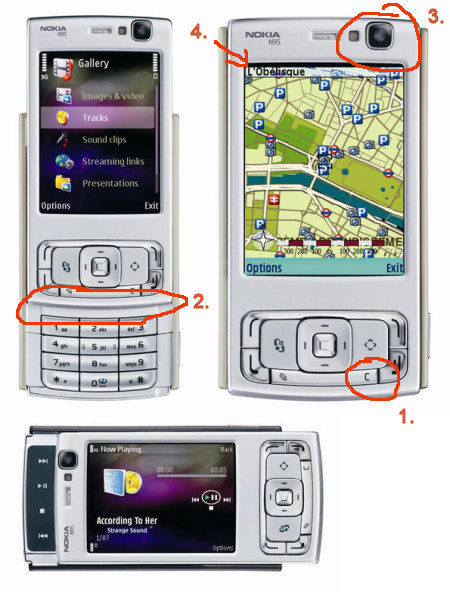
1. the keypad on the front cover (“S60 keypad assy”) is way too narrow and I understand it was already moved down and away from the screen to shorten the distance to the actual number keypad (Nokia calls this the “ITU keypad assy”).
While writing text (e.g. sms), I sometimes type in a wrong letter which needs to be corrected. Hitting the delete (“C”) button on the front panel sometimes – unfortunately – results in hitting the red phone button by mistake => the phone goes back to the standby screen. Argh. A redesign thus should include the delete button to have a bigger size. Also, the overall size of the keypad should make use of the whole space left on the front cover.
2. Other slider phones from Nokia such as the 6110 navigator or E65 come with a gently inclined front cover. While writing text on the N95 number keypad, my thumb often hits the edge of the front panel. This could be avoided or limited by removing this artifical border and reshaping the front cover so that the thumb may freely move between the (lower) number keypad and the keypad on the front cover.
3. The front video camera on the upper right corner looks like as if it has been put there at the last moment. Obviously, there should be a better way of moulding it into the front cover.
4. I “secured” the display on my N95 with some BRANDO display protector (foil) as it a) looks as if the screen actually is a bit sensitive to scratches and b) there’s a gap between the display and the frame = no seamless transition between the display and the frame as seen with other phones (= which shows that such an approach to a better design is possible).

my 5-minutes paintshoppro’d version on a change I’d like to see on the front cover keypad..
As these modifications only apply to the cover, and exchange covers are already available via ebay & co, such a redesign should actually be possible and isn’t too far fetched. Chinese manufacturers (since you’re masters of copying adopting designs anyways) – are you listening?

OK, you’ve just torn the N95 almost to shreds and obliterated the warm feelings i had about it. it was my fav phone even though i haven’t actually used one. Hoffentlich s.o. (in China, i guess) picks up on your redesign suggestions and gets you to test them…how’s cool would that be? Just curious: is your mobile service with T-mobile? Coz they’re the ones offering the N95 out here.
Hey, thx for stopping by! My mobile provider is called Blau which is one of the cheapest in Germany. All four big providers actually suck so much that I happily switched to this rather unknown provider who also happens to charge kidoooogo tuu on the minute & sms. T-Mobile is a rip-off, just like Vodafone. At least here in Germany. And if they provide the same kind of “service” to their US-customers, I wouldn’t like to be forced using their services over in the US.
(and branding is just another horrible issue)
As for the N95 – well, it is a nice phone. The camera really rocks for a mobile. In terms of usability though, I was a bit faster on my 6230i. I think such a phone only makes sense when used in a network that’s able to provide a decent 3G network. Dito the iPhone.