wising up

Standards vs. ergonomy

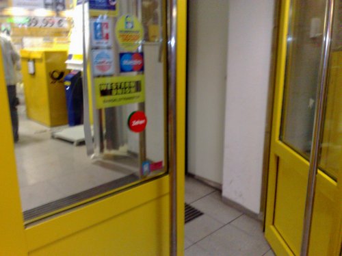
The main entrance door to the Deutsche Post branch office at Frankfurt railway station.
05012009232

There’s a fire safety regulation in German law which says that such doors have to open to the outside so that in case of emergency, the panic crowd may escape without any obstacles.

Despite of this regulation and although most doors in shops and offices are designed to this standard, many customers stil PUSH the door to the inside until they realize it opens by pulling the handle. There even is a sticker that says ZIEHEN (= pull).

Always reminds me of Gary Larson’s “School for the Gifted“.

Our future is in Africa
05012009233

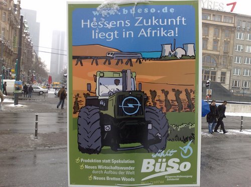
An election poster for the upcoming elections in the Federal State of Hessen. Instead of the usual mugshots of fugly politicians, these guys came up with the image of a tractor, OPEL logo, the Transrapid, a nuclear power plant and some messages that are supposed to attract floating voters.

While I think that Europe and Africa should team up and support each other, the “Bürgerrechtsbewegung Solidarität” (BüSo) is in fact a very small right wing party with quite extreme ideologies. Germany, Europe, the world may indeed need to rethink what really matters – but voters should also inform themselves about the political parties and understand the real message behind such propaganda + how they are being lured into the world of extremists.

Their candidate talks about the “Africanisation” of Germany – e.g. how living standards have deteriorated over the years, similar to many African states (sic!) – and how the German economy nowadays relies on products from the outside.

While most parties actually suck and have similar concepts, it’s still much better to have a working democracy instead of fashists from the US who try to undermine Europe. Somehow similar to what Declan Ganley does in Ireland, but on another level.

paper world
05012009231

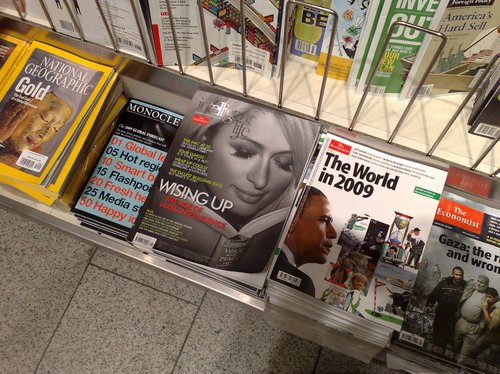
Paris Hilton on the cover of “intelligent life“, a lifestyle magazin by The Economist.

Are you bored enough to read or at least page through any lifestyle magazine these days IF instead there’s something else called internet?

And two more questions on the traditional media (e.g. print):

a) How often do you, as a reader of this blog, read printed lifestyle magazines? And where? Do you buy them?

b) From my perspective as an internet geek (or “internetty”, as a colleague called it one day): where do you read, hear, see the general news? Do you read a (daily) newspaper on a regular basis and supplement this with some extra magazines? Or have you completely moved your news-addiction to the onlinesphere?

Am asking because I think that it’s especially the older generation that still prefers print editions + have been wondering on how this impacts on society in general.

understanding user interfaces, part 1

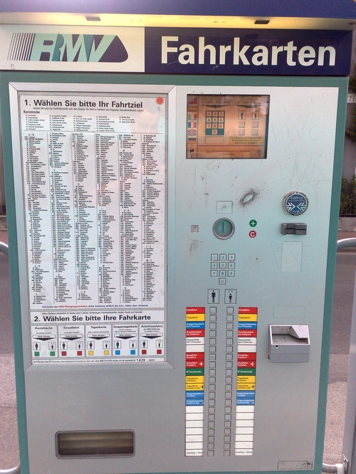
As much as I dislike rants on this blog, there’s nothing worse about local public transport in the Rhein-Main area (Frankfurt am Main et al) than this ticket machine in use at all metro stations:

29082008509

Even though the menu is available in different languages, obtaining a valid ticket is really complicated for those who do not know how to operate it.

  1. for tickets within the City area of Frankfurt am Main, just press the “Einzelfahrt Frankfurt” button which is the 7th (red) button on the left column.
  2. for tickets to destinations outside of the City area, one has to choose it from the list on the left (note: not all are listed!), type in the corresponding 4-digit number and choose “Einzelfahrt” (first red button on the left column marked with an adult icon/pictogram).

As you can see from the picture, the machine also accepts banknotes, chip cards and certain mobiles. Pls also note the already mentioned coin-scratch-area to the right of the coin slot which – for some reasons – is ALWAYS on the same spot with all machines.

RMV apparently knows how bad their machines are – which is why they’ve published a detailed explanation online.

What I dislike about these machines:

Why make it complicated if it can be done way easier instead? Just put a coloured map of destinations on the left and assign 4-5 buttons on the column to the right that correspond to the coloured destinations.

Why do they offer the (rather primitive, no-touch-) screen in five different languages (German, English, French, Italian, Spanish and Turkish) if the rest of the machine is kept in German only?

If they’re already using pictograms for language symbols and age groups, why can’t they extend this to the overall interface?

Too many buttons are confusing! After all, you just want customers to obtain a valid ticket. 4-5 buttons are enough!

Do not offer too many steps during the ticket-selection-process. Instead, use something like this:

  1. Destination?: Where do you want to go? 1-5 price groups, not more!
  2. Discount?: Adult or child (~ discounted tariff for disabled, elderly, students, children, etc.)?
  3. Payment?: Insert money (bank notes, coins, chip cards, mobile RFID chips, etc.)
  4. Done!

Sometimes I just wish I was working in automation engineering (instead of in the field of ecological sanitation systems) and could approach the RMV with a simple upgrade proposal for a better user interface on their ticket vending machines. And this although I am not even an Apple user :-) and since there are others out there who are real professionals for keeping things really simple. Much like the upcoming elections in the US, anything is better and will be an improvement to the existing system. Right now the purchase of tickets through these machines is more complicated for most customers than programming your VCR.

Also, if I was into automation engineering and had to deliver a diploma thesis, I’d cover this subject.

p.s.: The red little sticker next to the mirrored image of yours truly & “Wählen Sie bitte Ihr Fahrziel” actually indicates when it was cleaned (!) for the last time.